Search This Blog

Sunday, January 20, 2013

Master Bedroom redo


I decided I couldn't stand waking up another day in my tragically non-modern bedroom any longer. I was victim to buying items at rummage sales, department stores and thrift shops that were practical yet ugly, didn't compliment the room, or were just a poor choice.  
The east wall, foot of the bed.

The dresser is against the West wall. It was a "I just got divorced and need a dresser and this one's only $20 at a rummage sale and they will even deliver it for me, so yey!" purchase. This dresser holds my present husband's stuff. Don't you love the gold trim accents? The table in the corner is just a three-legged accent table from Walmart that I've had since 1998.


It all had to go! First the decals came down off the corners of the walls. The old dresser moved out (there was a second small horizontal dresser that isn't pictured as  I had already moved it out of the room. It was on the north wall and held the TV and my items.

The drapes, all though not completely ugly, were ill fitted for the room. I also drew the conclusion that I have small windows that are very oddly placed. They needed to be "bigger" and more centered to the walls.

I could have painted the old dressers to be more modern, but that wouldn't have solved the space issue (which was that we needed more space.) So I got one larger dresser for my husband to share instead of each of us having our own.

Here's the finished product:
The bed is now against the East wall which is longer, but the door from the closet opens to it. I made the window "bigger" by using two curtain panels that cover the window and part of the wall. Also hung them up by the ceiling instead of on the window frame. Common decorating tip to elongate the wall. New drapes were on sale for $9.99 each from $19.99 each at Shopko.


Score! I got the paint off the mis-tint shelf at Menards. Be sure to check out that shelf before you go through the agonizing process of selecting a color out of that terrifying wall of paint chips. While this is not the color I would have picked out had I been on my own, it turned out to be perfect! The finish was satin (perfect for an adult's bedroom) and it only cost $5 instead of $22!


New bedding from Macy's, was $400 but got on super cyber sale for $169. Watch your cart when you shop online! What is full price today might be less than half in a few weeks!

This is the South wall  (where the bed was originally). Got a new  metal tree wall hanging. ($35 down from $100 at my local furniture store). "Bigger" window again.

The West wall. My existing jewelry armoire where the Walmart accent table used to be. New dresser ($538 down from $899 at the furniture store). Yes, Big Bang Theory is on.


My new six foot mirror from Shopko. Have been seeing a lot of these in magazines  lately and with the loss of my  dresser mirror I needed a new one. Originally $199, on sale for $99. Debating if I want to keep my preexisting wallpapered wall as the wall paper doesn't match the new paint, but I do rather like the pattern.


My free chair. Curbside find, was originally covered in a really ugly and dilapidated wheat patterned fabric. Ripped it off and put on the really pretty black and white fabric. It already had the really nice white paint job, just needed to be cleaned up. I made the pillow, too. It's upcylced from a ton of old buttons that I had on hand, an old pillow case from a bedding set that I no longer use, and some left over fabric from another project.


I stained and painted my little nightstand to match the mini-dresser. giant pain in the ass! It's a Sauder or something of the like, so really had to sand down the top to get to the actual "wood" beyond the MDF veneer.

I have nightstand lamps! I'm such a grown up now! Previously the only light in the room was from the over head light. I found this irksome as sometimes I like to read before bed while my husband likes to conk out, the selfish jerk. Anyway, these mini lamps were perfect and they don't take up much space.


Mini dresser before. I had to sand the whole thing as it had quite the coat of  shiny finish on it.

Here's the finished product. It's a copy of another Pinner's original.
I sanded down the whole thing, then put three coats of ebony stain on the top. Then primed, painted and distressed the rest of it. I got the drawer pulls from a rummage sale for .25c each, and the house numbers are from Menards, less than $1 each. The paint color is Dutch Boy Vanilla Custard, also from Menards (we don't have a Lowe's, Home Depot, or a Benjamin Moore in town, so I use actual products that real person would buy, not everything is Sherwin Williams like in Country Living.)
A tip for distressing, don't paint all the way out to the edges! Then when you sand down the painted parts to get your smooth finish you don't have to sand all the way through it to get to the wood again.


I did the same thing to my Sauder night stand. It was a huge pain in the butt to get through the "finish" to get to the sweet spot that was still showing the "grain". Then primed, painted and distressed the base.


I made the Love sign as well. Click here for the tutorial.


Friday, July 27, 2012

Book Page/Wall Decal wall art

This is my variation of another similar project I found on Pinterest that involved a canvas and making your own decal with a Sharpie. I'm not that talented, so I decided to use black wall decals.

I found these large frames at a garage sale for $10. They were probably a quite impressive pair of wall decor back in 1992 (they were silver background, 1/4" spacers with a p and puffy paint-esqe Indian inpired feathers. They had to be destroyed. First things first, ripped open the backside, pulled all the silver crap off the foam backing and spray paint the frames ivory.

Now for the fun part! Mix 1:1 Elmer's glue and water:


Rip a bunch of pages out of an old book. I think I actually got this one for free at a rummage sale (the guy threw it in with a few other odds and ends I was getting). It was published in 1938 so the pages were nice and yellowed around the outsides. (Relax, I looked it up on Amazon to make sure it wasn't actually worth anything.)


"Paint" a layer of glue mixture on the backing and then quickly place the pages on the glue before it dries. Then brush on a layer of glue mix on top of that. Make sure you get it in between overlapping pages otherwise they won't lay nicely.


Allow to dry overnight.  Then coat with a second layer of glue mix. Be sure to look for any loose spots. When dry trim the excess off the edges.


Once completely dry (best to wait overnight again) pick out a great wall decal set from the store or make your own with your Cricut. I bought mine from Menards for $19.99 as I really liked the set. It's best to choose a black set as the colored sets are kind of see-through and that will prob ruin the effect of the image.


I cut them all out and arranged them on the backing so I could play with the space I had to arrange them.


Then, peeled, sticked (ha, I know it's supposed to be stuck), put back in the frames! Since I ripped out the staples that originaly held the back in place, I used flat top thumb tacks inserted at a 45* angle to snuggly hold it in place.


Peanut Butter Bacon Cookies

If you want the full "Elvis" put some banana chips in with the batter, too!

So, here's what I did: I took the basic classic chocolate chip cookie recipe:
2c flour
1c sugar
1c brown sugar
1tsp baking soda
1tsp baking powder
1tsp salt
2 eggs
2 sticks butter
1tsp vanilla extract

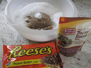
and substituted one bag of Oscar Meyer turkey bacon crumbles and one bag (1 2/3 cups) Reese's Peanut Butter chips for the bag of chocolate chips.


For a "healthier" (read: not as bad for you) cookie, use these substitutions (this is what I did).


Add your wet ingredients to your dry ingredients and stir until well blended.

Drop by rounded tablespoonful onto parchement paper lined cookie sheet (parchment paper works best especially if you are doing the lower fat/calorie recipe.) Bake at 375* for 10-12 mins.

Voila!


Friday, May 11, 2012

Something fun I did for a Mad Hatter themed bridal shower I did. I transformed my garage into the Mad Hatter's house. I wanted to have the party outside but it had been raining for several days prior to the shower so I moved it inside the garage. I strung tons of ribbons, fabrics, string lights from the rafters and hung teacups as well.


Plate and teacup "flowers":


Roses painted red:


Eat Me and Drink Me tags:


Teacup candelabra: 


Get great Mad Hatter Tea Party stuff at thrift stores or rummage sales: Mismatched tea sets, plates, and glasses. Plain tableclothes or lace curtain panels that can double as table clothes. Old platters and serviceware (especially if it's silver). Make your own cake stands with large dinner plates and tumbler glasses and some craft glue. Sprinkle playing cards on the tables. Tape the Queen of Hearts on the bottom of a plate and that person gets a door prize.


Friday, May 4, 2012

Love Button piece

I saw this super cute art piece on Grahm and Green but at 240 UK pounds (yeah, that's like $600!), I knew if I wanted it I would have to make it myself.
First, as always, the base for this project was an upcylced find from Goodwill. I didn't document this project so we'll just have to use our imaginations. The original print is in the back wall of this pic (from my baby shower) in 2006. I bought it for a whole $2.99 at Goodwill in 2005 because it matched the palm tree decor I had going on at the time (and yes, I know better now).

So, the ugly pineapple print got moved when we bought our house in 2006 (right after the baby was born) and then I moved it out with me in 2009 when my husband and I were divorcing. It got a small rip during the move, but for some reason I didn't through it away, I just kept moving it around and even tried selling it at two summer's worth of rummage sales for $1 thinking that some creative person would pick it up and do something with it but, no! Well, Lucky for me because it was the perfect size for this project.

First I removed the decorative metal half circle rivets that went all around the outside. I spray painted ivory over the pineapple just to get it covered up.

Then I printed the L O V E at 750 point in Baskerville Old Face... font. I trimmed the paper to fit my canvas and taped it in place. This was the template. 

I had several yards of ivory fabric (another Goodwill find at $2.99) left from another project that I double layered and fitted over the canvas. Then pulled tight and stapled temporarily in place. I sorted my cache of buttons in the four colors I wanted to use and then proceeded to get them laid out on top of the letters underneath the fabric. I hot glued them in place, but if you really wanted you could sew them on (but with the paper underneath you'd have to rip away what wouldn't get stitched in place). 

After everything was in place I removed the staples on two perpendicular sides so I could remove the sheets of paper underneath. I pulled the fabric tight again and stapled back into place, also added more staples around the other edges to keep it pulled tight. Then trim the excess fabric and reattached the metal rivets when I was done. Viola!


Monday, April 30, 2012

Upcycled Button Tree

Hello, and welcome to my first published project!


Today I'm inspired by something I found on Pinterest made by a very creative person that goes by http://bunnygoround.blogspot.com/ I loved Bunny's super cute use she put to her grandmother's button collection but couldn't find her editorial so I thought I'd document mine while I made this project.


First things first, the essential base piece which I found at a rummage sale for $5. It was a quaility canvas item, probably originally from World Market or someplace similar. The brackets and hanging wire on the back are really nice. But whoever owned it previously got some weird spots on it (I'm going to pretend it's toothpaste) and the subject doesn't really go with any of my decor. So, upcylced it gets!


First I scrounged in the basment and found some paint that was leftover from painting other rooms of the house. I wanted to do a graduated background so I picked DutchBoy's Blue Lagoon (previously from the living room which has since been repainted) and Crayola's Grey (from my stepson's room).


First, a layer of Blue Lagoon. I went about halfway down the canvas with it. Let it dry, then added a second layer. I chose to do the sides as well. I set the canvas up against the corner of my kitchen cabinets and taped a plastic bag from Menards on the corner to protect my cabinets from wet paint.


Then, I mixed a little gray with Blue Lagoon in a plastic cup and just stirred it with the original paintbrush.


Now for a layer of gray/blue in the middle. I did this while the all blue layer was still wet so that I could pull the gray/blue through the all blue to blend it a bit. 


I added more gray to the mix for the last layer.


I flipped the canvas over and did the last layer of mostly gray with some blue in it. Again, I applied it while the blue/gray layer was still wet so I could pull all the colors together.


Now to paint on the tree branches. I didn't have any brown, but that's okay because it's easy to make brown with other colors!

I used a pencil to draw a basic outline for the branches just so I didn't get paint on the canvas just to realize I didn't like where the branches were going.


Painted branches. They don't have to be perfect since the buttons will cover up quite a bit of them.


Now to dig out some buttons!


Sewing the buttons on is a huge pain in the butt. I'm not going to lie. But so worth the end result! I liked the inspiration piece a lot, but I wanted some color in mine so I apple-blossemed it up by adding some pink buttons to the mix.


The photos just don't do it much justice, so here's a few different angles.


Thanks for looking and stayed tuned for more projects!